The power of color
We’ve heard it many times, “I’m not a fan of yellow” or “it has to have blue, it’s my favorite color,” but did you know that the colors chosen for your brand shouldn’t be chosen by personal preference? Colors have this amazing way of influencing people. They have a powerful way of evoking emotion even if we don’t know it.
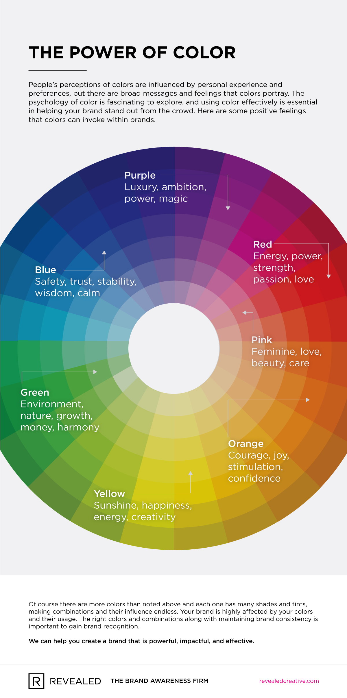
While people’s perceptions of colors are influenced by personal experience and preferences, there are broad messages and feelings that colors portray. Using color effectively is essential in helping your brand stand out from the crowd.
Where we start
When we are designing a brand or working on a brand refresh, this isn’t a step where random colors or preference are thrown together. Colors are carefully selected that will be effective. At the start of a branding campaign, we intentionally leave out color. We will expound on this in a future post, but color is so powerful and influential that we want the focus on the form of the logo so that it can be seen without any distractions. Then, we strategically add color to evoke specific feelings from your customer and reflect your brand’s personality. Remember, your goal is not to sell to yourself, but to sell your product or service to your customers.
Multiple colors = multiple meanings
So, what about logos with more than one color? Using a combination of colors creates interest and invokes different thoughts. Our role during a brand creation is to be sure the tones and colors work well together and effectively market your business. Each color has it’s own meaning, and we can help strategically mix colors to create something that your customer sees as “fun and playful”, “innovative,” or “strong and trustworthy,” depending on your target. We suggest logos have 2-3 primary colors for a couple reasons. First, for brand recognition – many people will remember your brand based on your color alone, and too many colors would be distracting and hard to remember. Additionally, in the event that you are printing anything on press, the more colors, the more cost.
How did we choose the colors in our new brand?
Our primary color palette consists of black and white with a secondary palette of cyan, magenta, and yellow. Our choice of a black and white logo was to provide a modern and clean voice that also places an emphasis on our work over ourselves. Black provides a feeling of elegance and mystery combined with white for a clean and simple feel. Our secondary palette was created from the purest of colors that, combined with black, also make up the four colors used in process printing. These colors provide a fun, bright, and energetic mood that contrast and work well together.
Your brand’s colors must reflect your brand personality, and are vital in selling your service or product. Let us know how we can help you!