4 Corner Resources came to us in need of a brand and website refresh that would match their nationally recognized expertise and outstanding personal service in the recruiting industry. Accessibility and SEO were very high priorities throughout the entire website design.
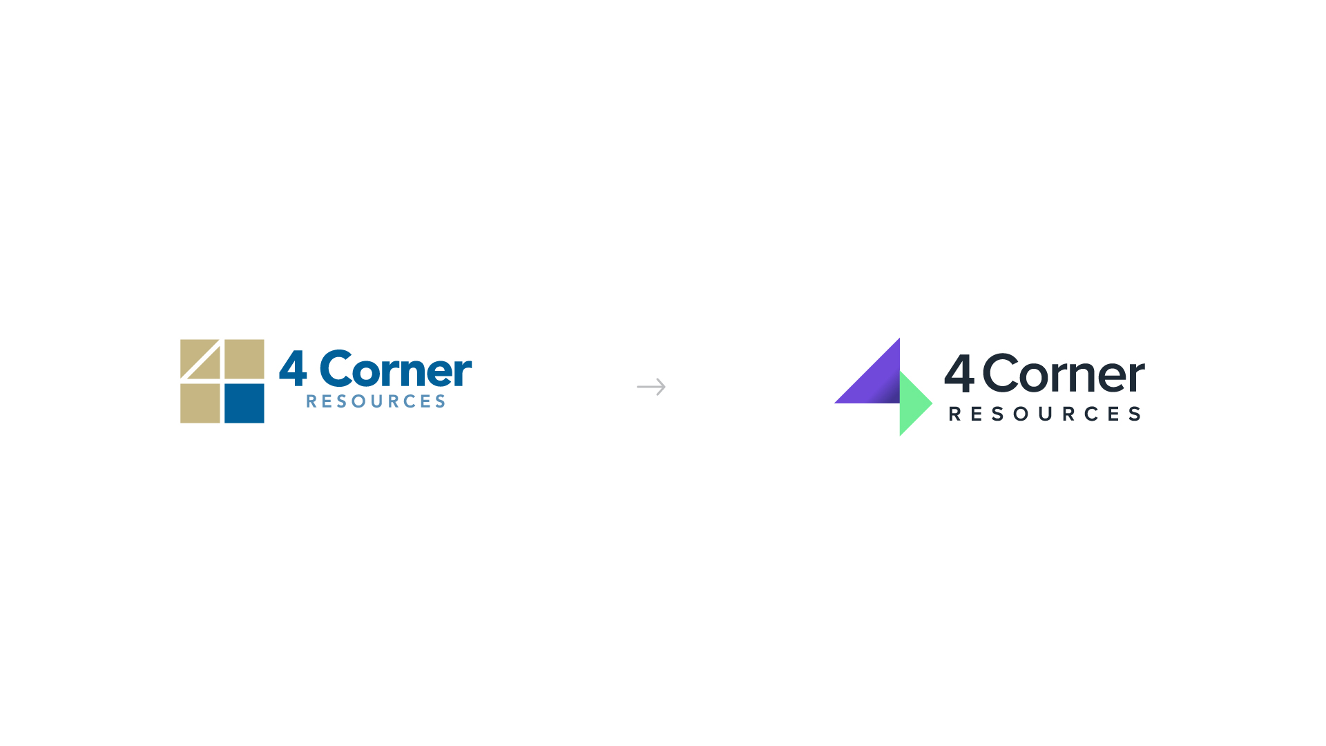
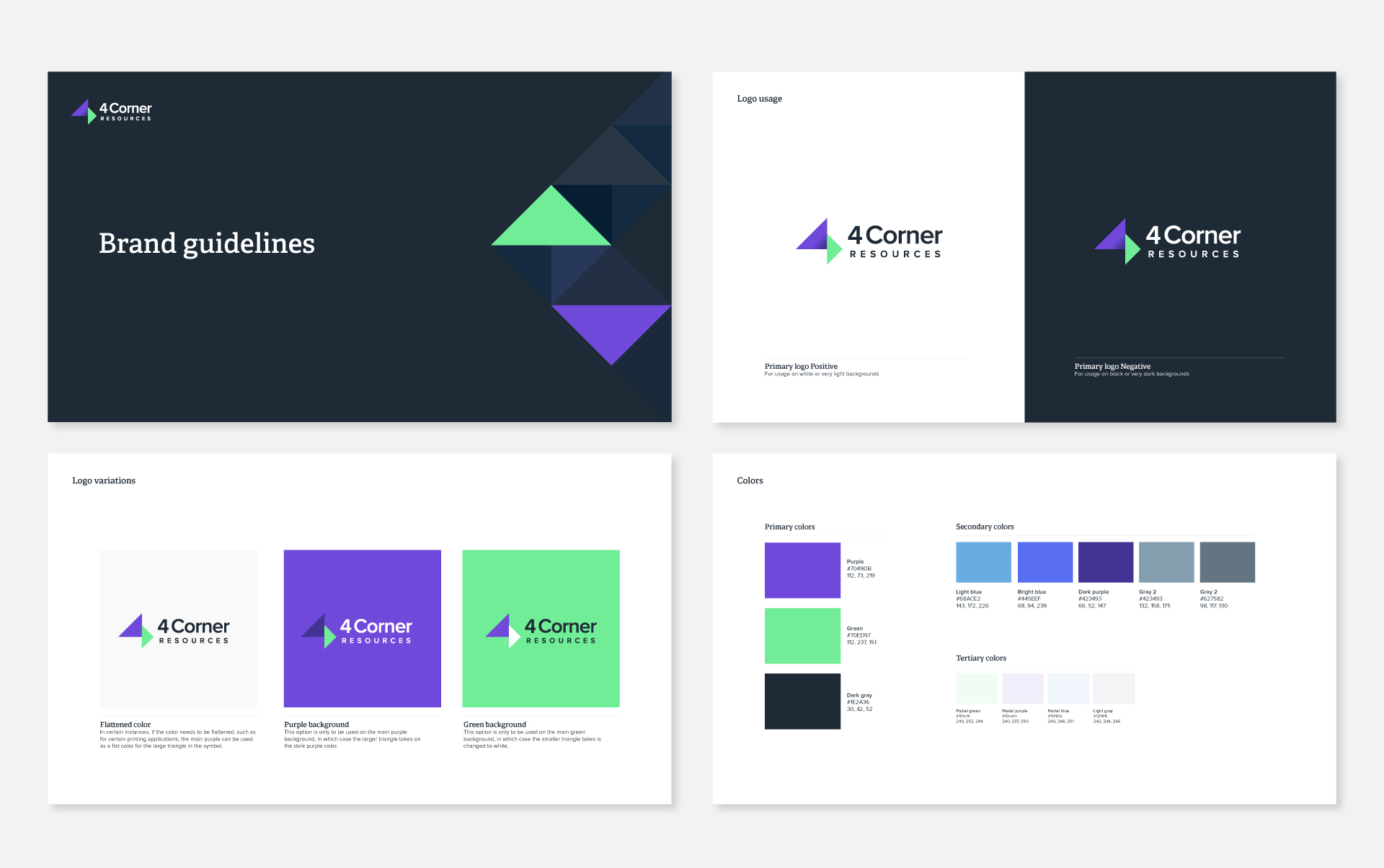
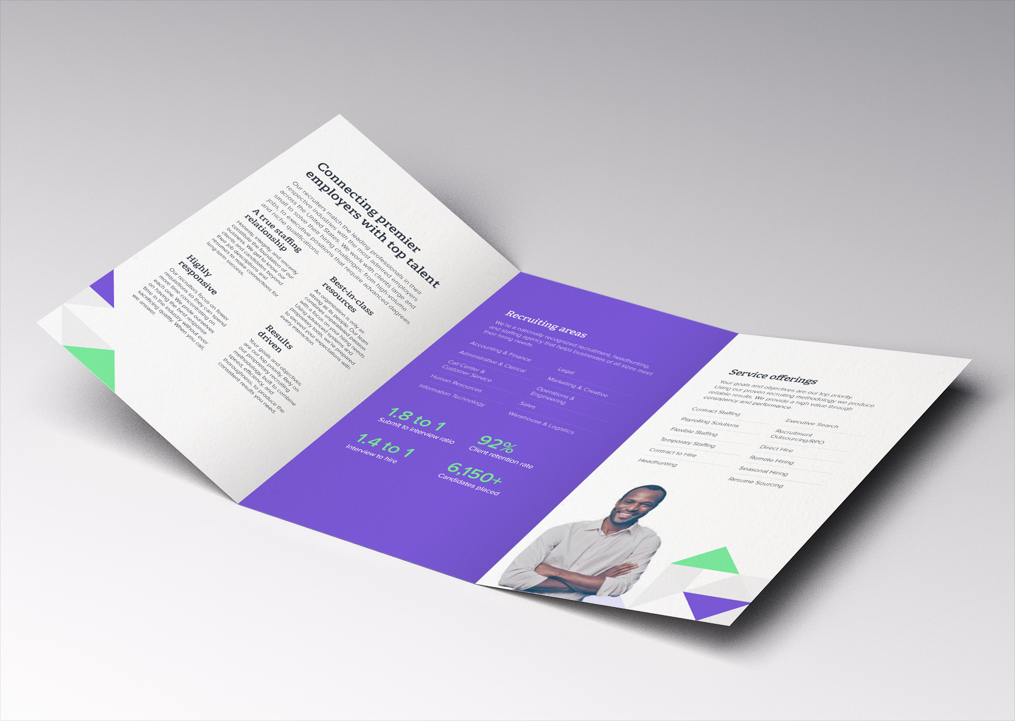
One of 4 Corner Resources differentiating factors is their ability to customize solutions for their clients. While the triangles in the logo represent an abstract 4, the identity also emphasizes solutions they offer through endless combinations and versatility of the triangle pattern.
A bright purple and green helps sets 4 Corners Resources apart from other recruiting firms. Purple is a great combination of the stability of blue and the energy of red.
All colors were also designed with accessibility in mind.